
Proton User Interface
Proton is a web tool for IOS App development. The platform is made for people with limited background in backend development to construct the software architecture of the app without touching code. Proton merges the visual interface with the backend programming. Over the summer I was involved in a two month long internship with Proton. During my internship, I took on the UX/UI challenge to redesign the Proton interface for non-engineers.

The software weaved together fundamental features for users to construct an app’s functionality without coding. The web tool allows users to 1) add “Interaction”, 2) add “Data Connection”, and 3) combine “Interaction” with “Data Connection” for the app to function.

Design Challenge
Prior to the redesign, the original graphic user interface was directly derived from programming logic. It only allowed users to build the app by selecting options with a drop-down menu. The interface was extremely difficult to navigate for users who have little to no prior knowledge of computer languages & software architecture.
Goals
After spending large amounts of time learning from the engineer, I was able to understand how Proton software functions from the technical stand point. Then I came up with goals for the first design iteration, that allow users to:
1.Easily understand how the software functions.
2.Intuitive linking function “interaction” and “data connection” to create their app flow.
3.Discover new functions as they build the app.
Current Flow

Current user interface analysis
Research Into Users
I created two user personas and a customer journey map to further understand the usability challenge within the web tool. To reveal the design gaps, I used the personas that I created to analyze what was wrong with the current interface. After studying the way the users learn the software, I summarized the conclusions I came to by creating the user journey map (below). The interface complexity and the steep software learning curves are the two major road blocks which prevented users from building a successful app.

User Persona 01
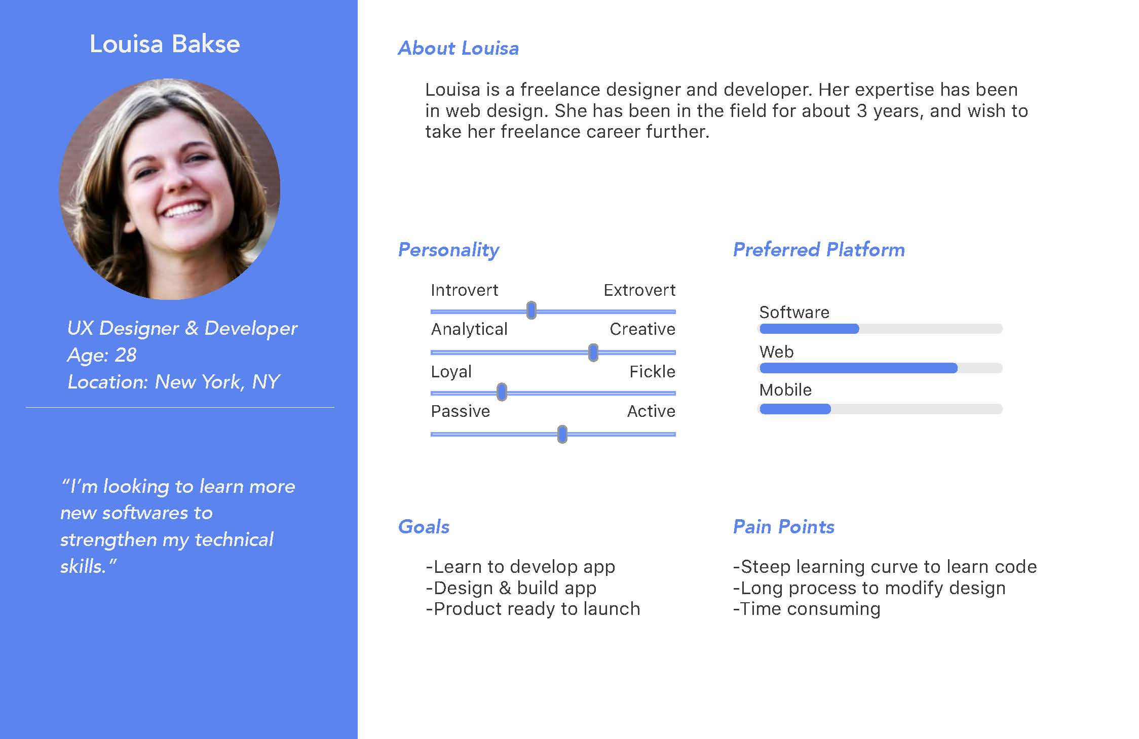
User Persona 02

User Journey Map
Market Research


Success
1.Self-explanatory building process
2.Low requirement on technical tolerence
Opportunity
1.Backend development functions


Opportunity
1.The interface is exclusive to software
engineers and developers
Success
1. Powerful development functions
2. Connecting frontend to backend
Concept Brainstorm

Site Map - To understand the information hierarchy
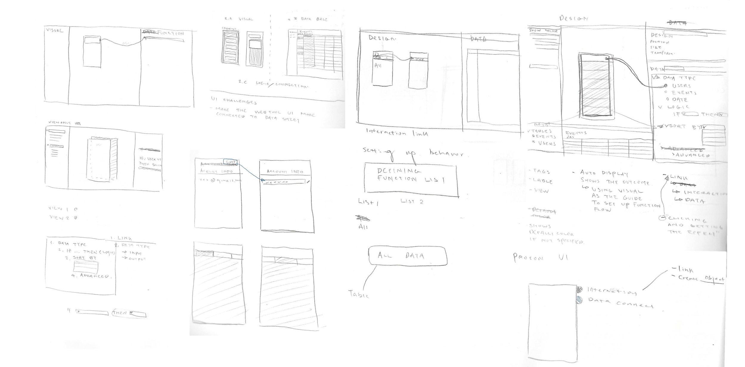
UI design sketching
Wireframes & User Flow
After identifying the two major road blocks that users face, I generated a new user flow that minimized the steps required for users to successfully integrate the “Data Connection” and “Interaction” layers. The original interface presented the user with an overwhelming amount of navigational information at once. In comparison, the new redesigned interface presents users with the same amount of information but in a structured, easy to follow experience. This design is made to reduce the information cluster that often disengages users midway through their app building process. The new design allows for users to navigate through the process step by step, as they move across their app development. This new user flow distributes the overwhelming learning curve to a more manageable level.


Wireframe for user creating interaction layer and linking data connection

*Design Iterations
Interactive Prototype
The prototype for the new design, included an intuitive connecting method between visual layers and data. I experimented and implemented a dragging interaction that physically connects the visual layers with data sets. This interaction allows for non-engineers to visualize how the software functions.


The new interface allows users to check on their database through a collapsing mechanism, instead of clicking on a separate tab. The collapsing function structurally merges data with the visual app design.
Live Demo
Result
Simplified onboarding experience - The new workspace page allow users to see the major functions at glance and guide them to the first step of the building process.
Visually integrated platform - Users are presented with both visual and data layers on the same page, that allows them to grasp at all their building components without additional clicks.
Structured information hierarchy - Each individual function is displayed according to the step of user’s building process, rather than exposing users with all option at once.
Moving Forward
The main goal for this redesign is to leverage the user experience into a less programming driven logic through the new interface. I realized there are many possibility to argument the user experience as I was coming up with ideas for the redesign. For the next design iteration, I hope to conduct A/B testing on two distinct interface mockups, to collect feedback from the users on both to find out which they prefer. Then I can take the result and dive deeper with my team to find out what an intuitive user interface should look like based on Proton’s unique functions. From there to develop a refined user centric interface that allows the software to expand to broader audiences.